
For the last few weeks, the number of Massachusetts cities and towns in the coronavirus red zone has roughly doubled, going from 16 to 30 to 62. And yet, there are still fewer communities in red now than there were a month ago.
So what happened? A sweeping, though abrupt, change to how the state Department of Public Health measures the risk of coronavirus transmission, which dropped the number of towns in red from 121 to 16.
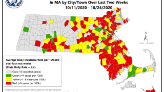
There were more changes, too: The map showing all Massachusetts community risk levels was removed, which a representative of the department told NBC10 Boston was because the map was no longer seen as being as helpful as it once was, now that coronavirus cases are being seen in most communities.
Those changes may be confusing, but according to experts from the area, they make good scientific sense.
"Yes, it can be disconcerting to have changes like that take place, but in general it's a way of providing the best possible science, the best possible information," said Dr. Lisa Gualtieri, a professor of public health and community medicine at Tufts University School of Medicine.
Where the Department of Public Health could improve, they said, is in how it communicates the changes.
CHOOSING THE DATA
How Massachusetts measures risk of coronavirus transmission isn't the only way that the Department of Public Health's data has changed throughout the pandemic.
In June, the state began reporting both confirmed and probable COVID cases in its totals, following guidance from the U.S. Centers for Disease Control. But by August, probable cases were no longer included in the daily top-line numbers reported by most news organizations.
"We're making these changes to both better illustrate the cumulative effect of the pandemic and to better understand the burden of the virus on Massachusetts at the current moment," Health and Human Services Secretary Marylou Sudders said at an Aug. 12 news conference explaining the change.
More recently, there were three straight weeks that brought tweaks to the weekly dashboard, which includes the town-by-town data as well as other data that doesn't fit in the 27-page daily report. Data on coronavirus clusters was added, followed by more data on clusters, followed by the changes to the coronavirus risk levels.
Watch the news conference where the changes to Massachusetts' coronavirus metrics were announced:
The public health experts interviewed for this article found the changes made to the Department of Public Health understandable.
"I think we're just witnessing, in real time, an evolution of how to think and report on the COVID-19 data," said Dr. Thomas Tsai, a professor at Harvard Medical School and Harvard T.H. Chan School of Public Health who studies public health, policy and data science.
Tsai works on a national map on COVID transmission risk put together by a group of academic and nonprofit groups. He said his team has been struggling as well with what data to present, to accurately show the rate that COVID is spreading.
The tools available to researchers working to understand the pandemic have changed. At first, there was only one way to test, the polymerase chain reaction, or PCR, test that looks for traces of the virus' genetic material in the body. But antigen tests, which look for viral proteins, have been added to the mix.
"Do we let an antigen test speak for itself" or does it need confirmation, Tsai asked. It's one of the many decisions public health experts have been wrestling with as the pandemic has dragged on.
"This is a really messy phase of the pandemic, where things aren't just 100% or 0% or right or wrong. We are in shades of grey," Tsai said.
He also noted that Massachusetts' original set of coronavirus risk levels were far more conservative than many other places', including what his own group of researchers was using. That adjustment, earlier this month, brought Massachusetts more in line with other states — something Sudders and Gov. Charlie Baker mentioned in announcing the change.
PRESENTING THE CHANGES
Nevertheless, it's important to effectively communicate those changes, said Dr. Davidson Hamer, a professor of global health and medicine at Boston University's schools of public health and medicine.
"It's always a challenge, if you have a publicly visible dashboard that's receiving a lot of attention and a lot of people monitoring, it to make changes," Hamer said.
He noted that there's been a conscious effort to keep BU's dashboard, which he's been a part of, consistent as much as possible.
"I think there's been an attempt by the state to be transparent, show a lot of information and basically have it evolve as people have given suggestions to make changes. It's still not perfect," Hamer said, giving the Massachusetts COVID dashboard a B grade overall.
But Gualtieri gave the department an A rating.
"I think that they're taking an incredibly complicated situation and they're really doing an extraordinary job communicating what people need to know in a wide variety of roles," Gualtieri said.
Coronavirus Case Count and Massachusetts’ Population
This map plots weekly coronavirus case totals on top of census tract data showing the percent population non-white, housing density and median household income of a given area. Click or tap for more information.
Sources: Massachusetts Department of Public Health Weekly COVID-19 Public Health Report; American Community Survey 2018. Note: The "COVID-19 rate per 100,000" is an incidence rate for the past 14 days calculated per 100,000 people and then averaged over the past 14 days for average daily rate. Percent non-white refers to the members of the population who are classified as non-white, e.g. Black alone, or Hispanic. For more information about how the Census Bureau defines race and ethnicity, see here.
Amy O’Kruk/NBC
To Gualtieri, the state's goal with the dashboard is to give communities as much information as possible to inform their decisions. From the perspective of a person concerned about coronavirus activity in their community — "Can I do this, should I do that? It's probably not ideal because there's so much information."
Sometimes the best way to reach residents is indirectly, she said.
Gualtieri has been working with the state in a limited capacity since March, creating a social media toolkit for local boards of health to better use social media to reach their communities, and following up with webinars and further advice.
Those boards can filter the state's more complicated data down to what's relevant and timely, according to Gualtieri.
"That can be a very successful process, as long as people are paying attention to information," she said.
Nevertheless, Gualtieri said the data presentation could have been thought through more, which is a problem that's seen throughout science: "I think lots of organizations are guilty about thinking of something from their perspective, not from the perspective of their constituency."
While Tsai would like a page that's simple to interpret and which integrates into computer programs, he said he'd rather have good data than good data visualization. He noted that the state of Georgia contracted out its dashboard, which looked nice but displayed questionable data — Atlanta Magazine called it a disaster that damaged the reputation of the Georgia Department of Public Health — and is a vastly worse alternative to what Massachusetts provides now.
"I actually think the Massachusetts dashboard actually has a really great wealth of data that lots of other states don't have," he said, calling the state's dashboard the equivalent of a Powerpoint presentation that's "very helpful to public health researchers and for public health response."
Admiration for Massachusetts' data isn't limited to public health experts in the Bay State, either.
Yale professor of medicine and epidemiology Cary Gross, who helped create a website that rates universities' COVID dashboards, found Massachusetts' dashboard to be "quite comprehensive," he said in an email, with important data on race and ethnicity as well as populations of interest.
His one note for the dashboard is adding "greater precision" around data on race and ethnicity: "Given that Black and particularly Latinx populations skew younger than the white population, it is important to adjust for age differences in the underlying population when reporting covid mortality, hospitalization data. Otherwise, you will be underestimating the magnitude of disparities."